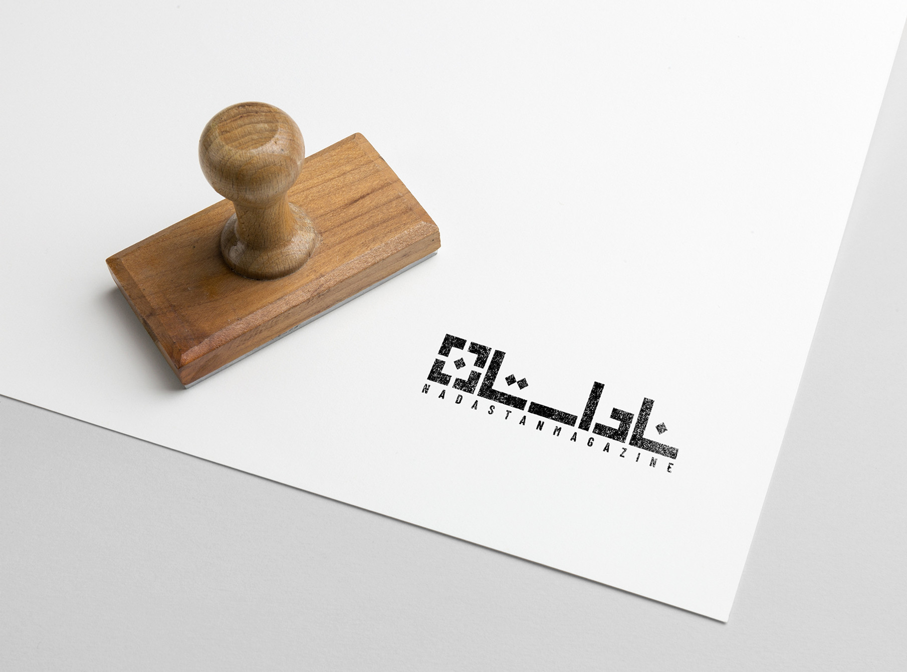
The logo design of Nadastan Magazine was based on the magazine’s general concept in 2019.
The magazine, which focuses on nonfiction, is divided into four sections: life story, documentary, old story, and self-portrait. According to this division, I decided to use four identical shapes in 4 different colors for design, but only the shapes that make a single image in the end and have something from inside the magazine and its name in it.
By combining these four shapes and putting them together, and placing a dot in the middle of the square shape, the last letter of Nadastan (ن) was created.
Nadastan is one of the best-selling magazines in Iran.


