krktr HR App
UI/UX Case study
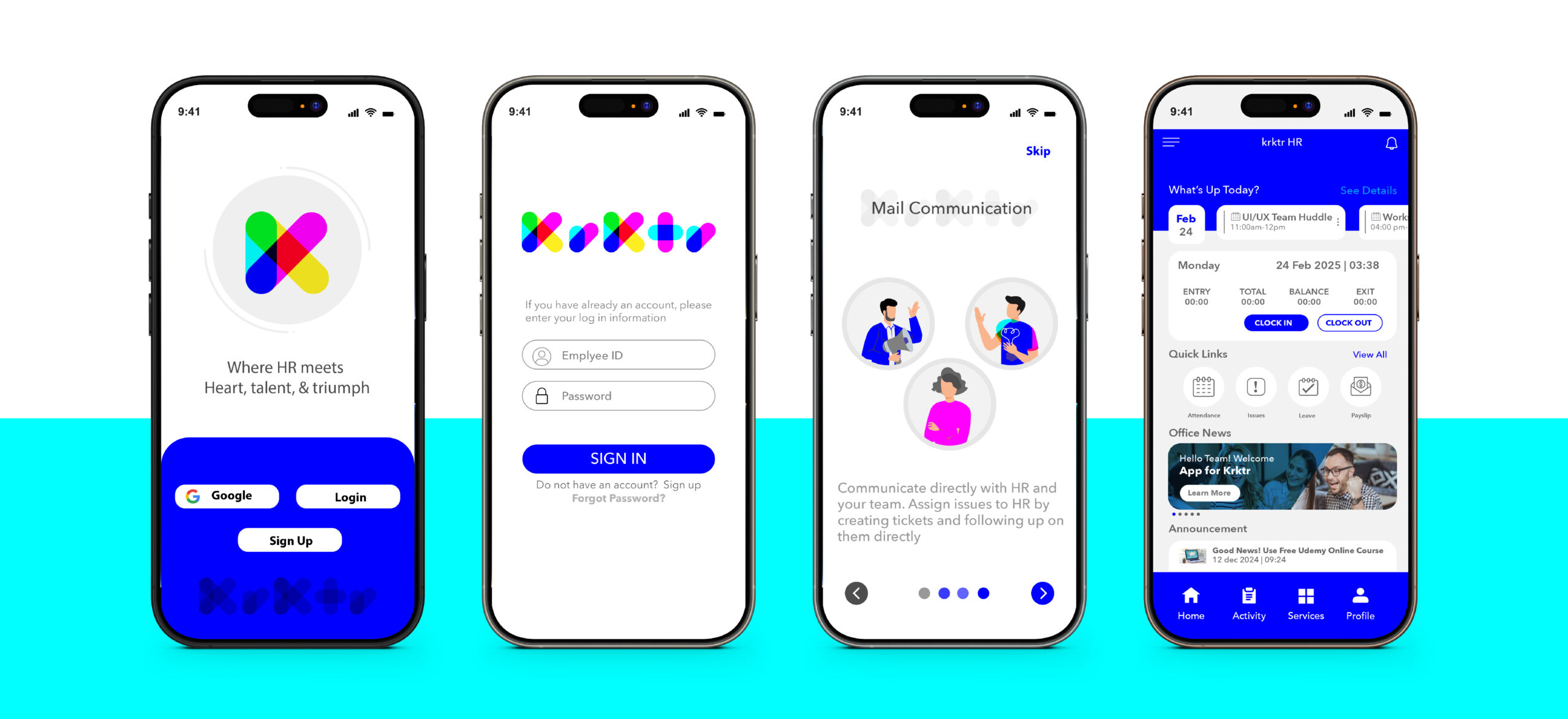
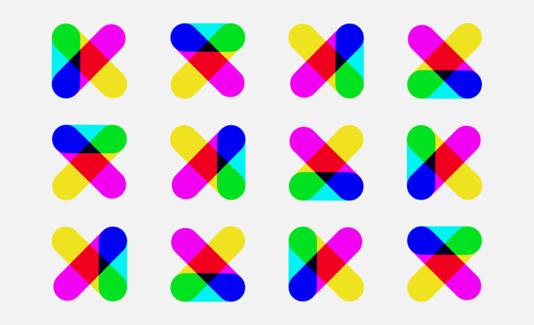
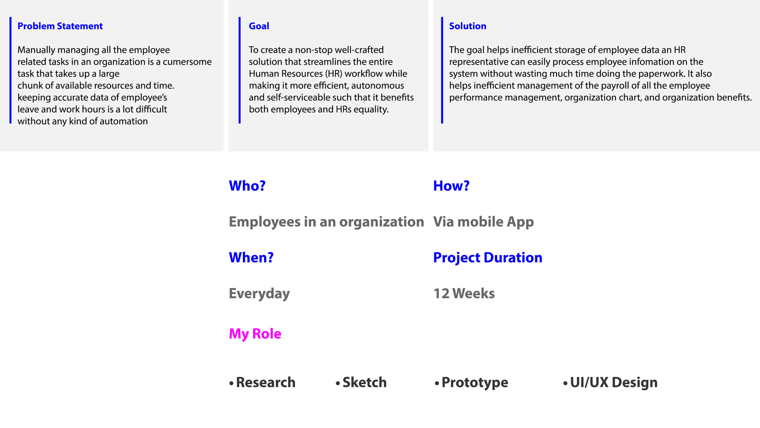
Human resources is not just about policies; it’s about people. Transparency is the foundation of trust, accountability, and meaningful workplace connections. That’s why I designed KRKTR, a name inspired by how we pronounce “Character” with its vowel sounds removed, emphasizing identity and workplace culture. KRKTR creates a fun and engaging user experience, keeping employees motivated while helping them manage their daily tasks efficiently. From attendance tracking and leave management to pay slips, documentation, and communication, this solution simplifies HR processes, reducing complexity and increasing productivity. You can see this theme of transparency reflected in the KRKTR logo design as well, reinforcing the app’s commitment to openness and clarity in the workplace.
Project Overview
Design Approach
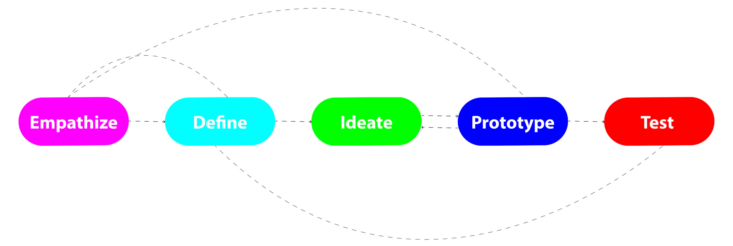
Design Timeline
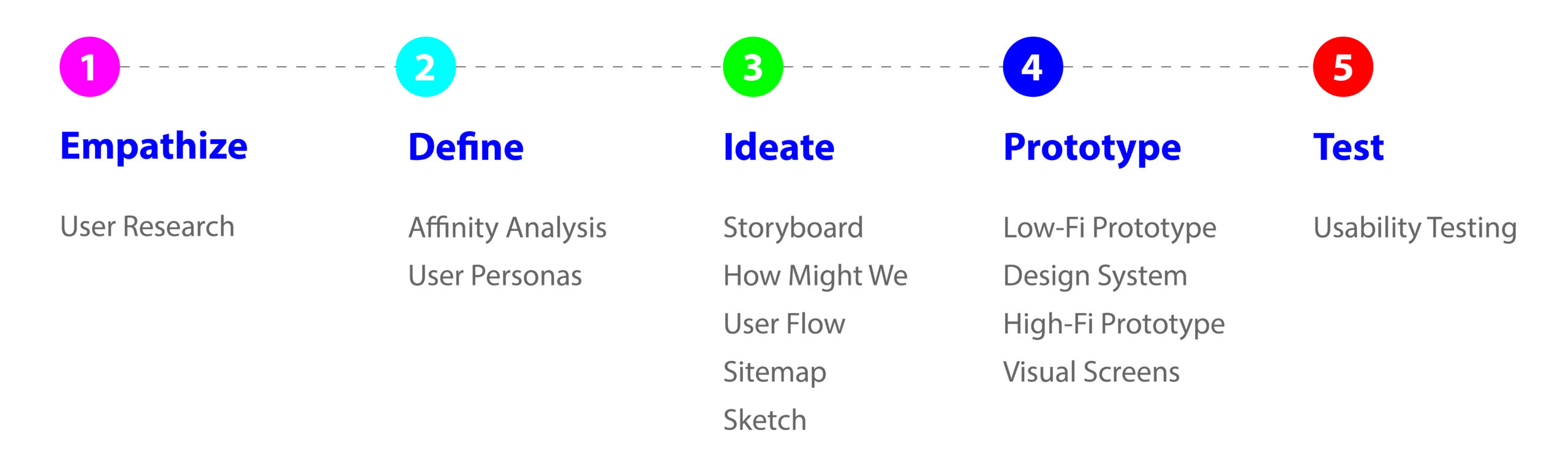
User Research
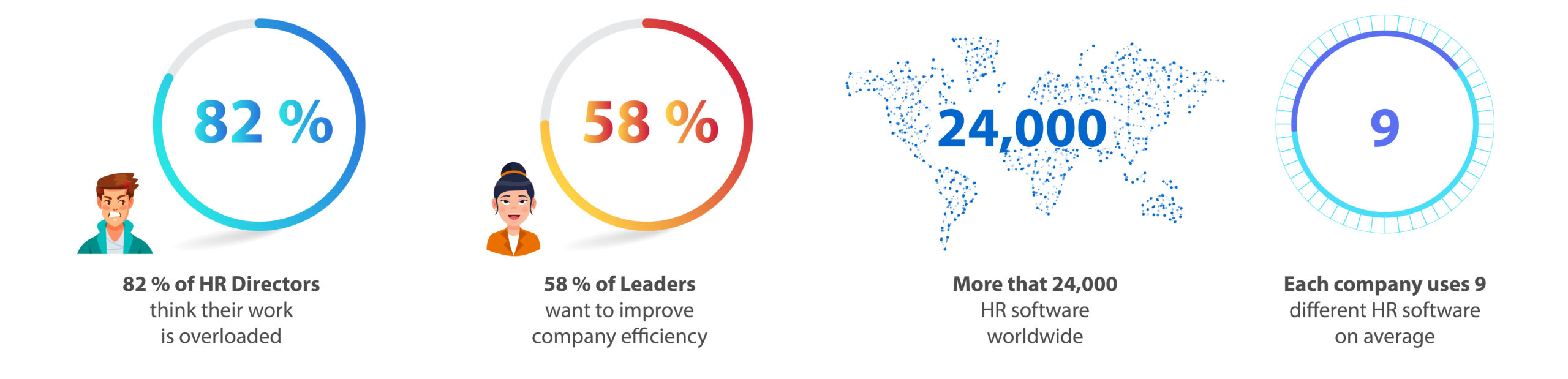
To begin this project, I conducted research to gather all relevant information on the Human Resource Management System and Employee Self Service. Here are some interesting statistics:
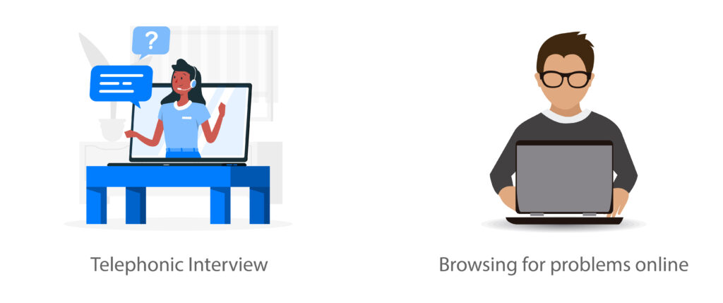
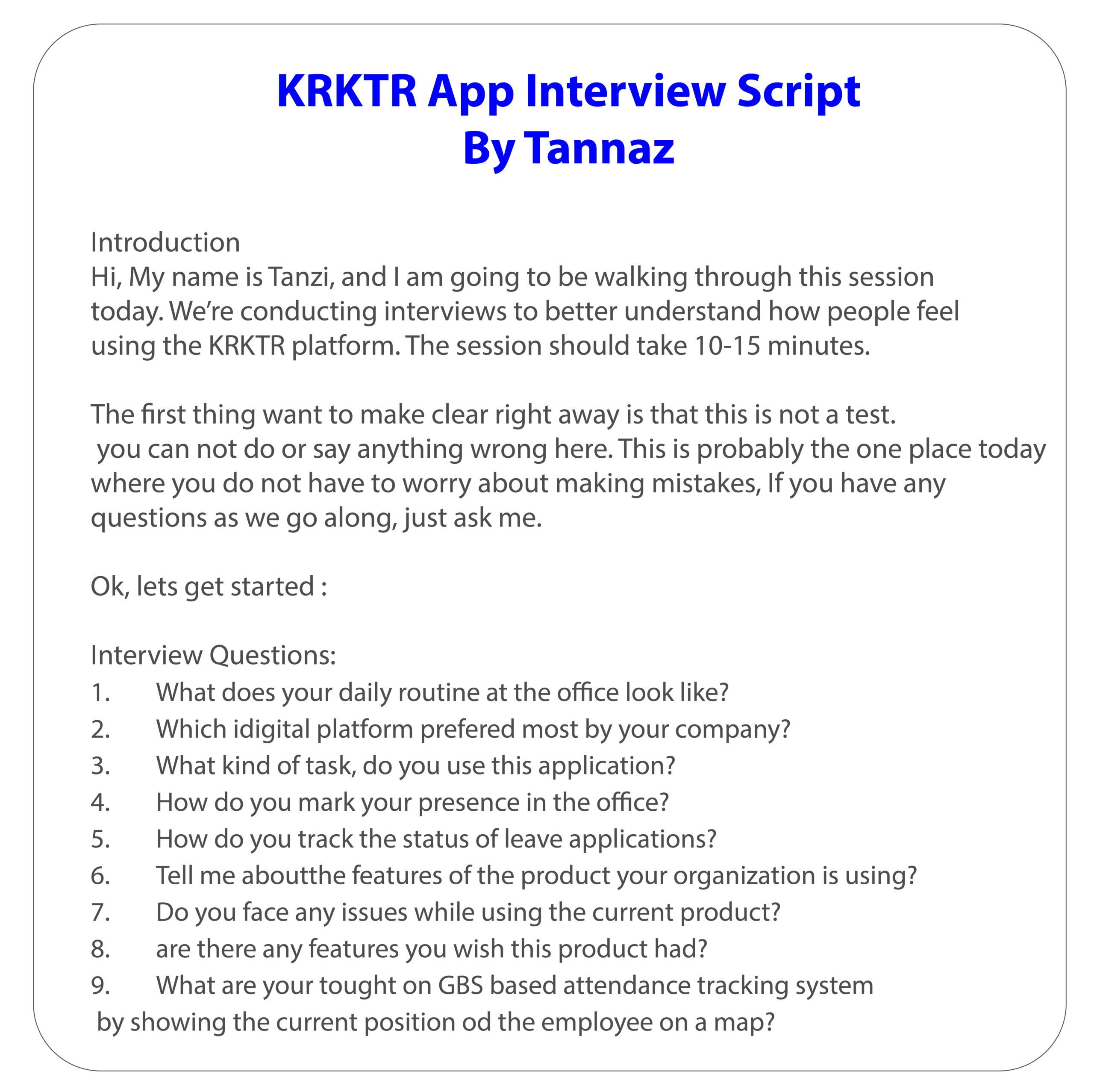
Now it’s time to talk with humans. For that, I’ve reached out to eight people who already use software for that.
This is a very important step in UX: If you want to design experiences for users, you need to talk to users. I’ve created an interview script to provide a general path to follow, while still allowing me the freedom to dive into follow-up questions without losing the main path.
User interviews were super insightful but also complicated at first. You need to give space to breathe and speak, without losing focus on the right topics. Follow the script, and you can not go wrong.
User statements examples
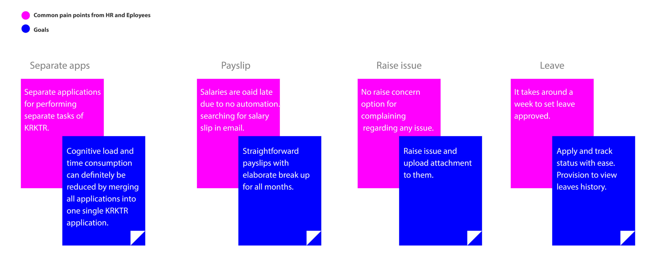
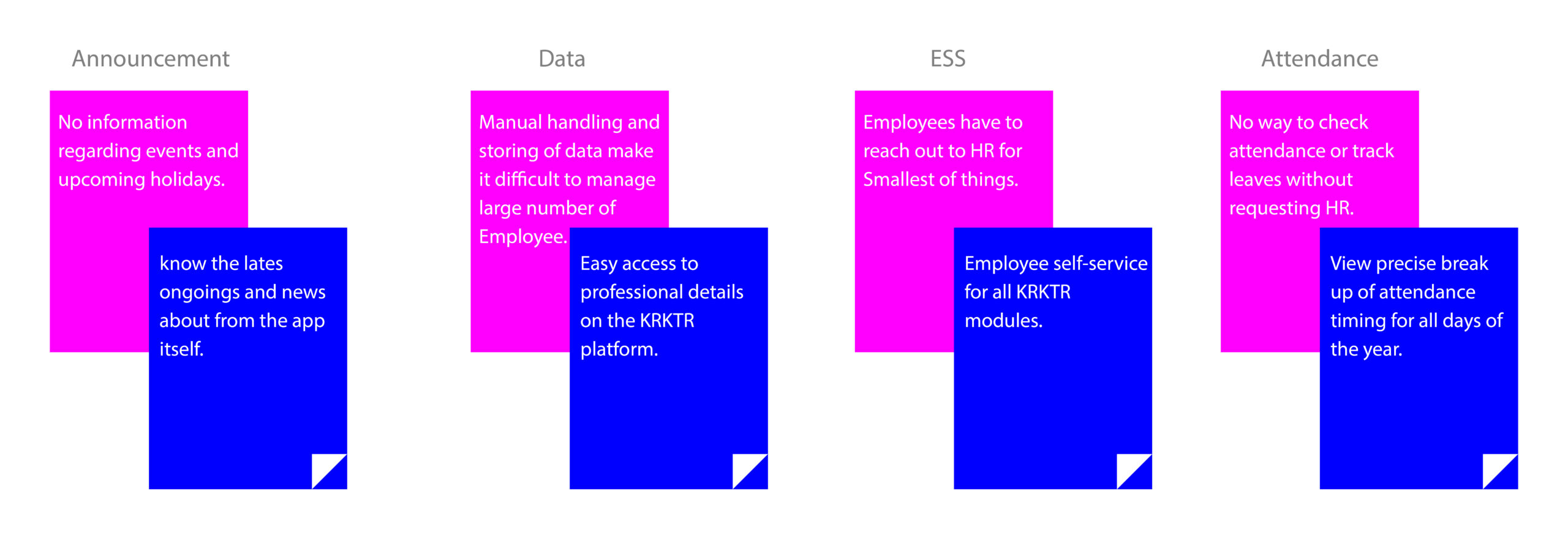
Affinity Analysis
The User Interview left me with more than enough data to filter through. Here is the digitized version of my affinity analysis for some of the users I interviewed.
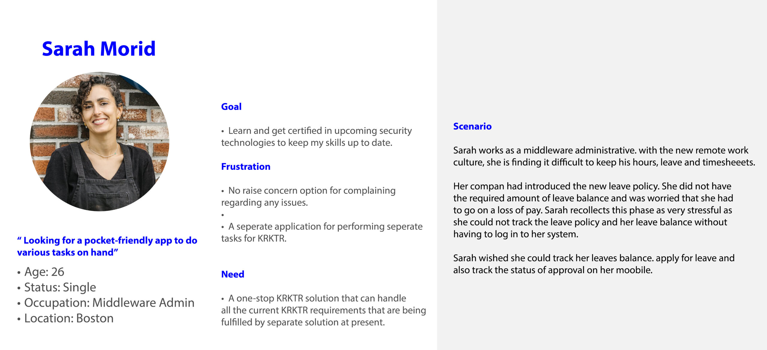
User Personas
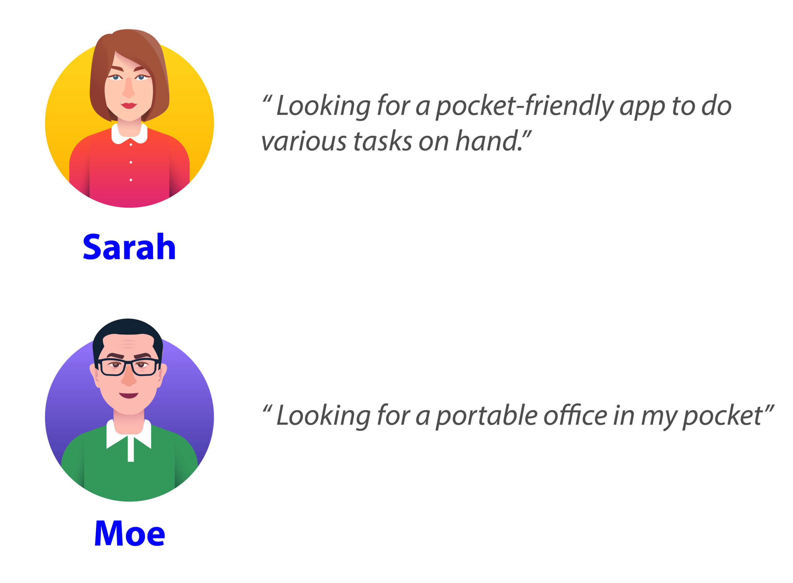
Meet Sarah Morid
To better empathize with Sarah, I provided context and background so I could understand Sarah’s needs.
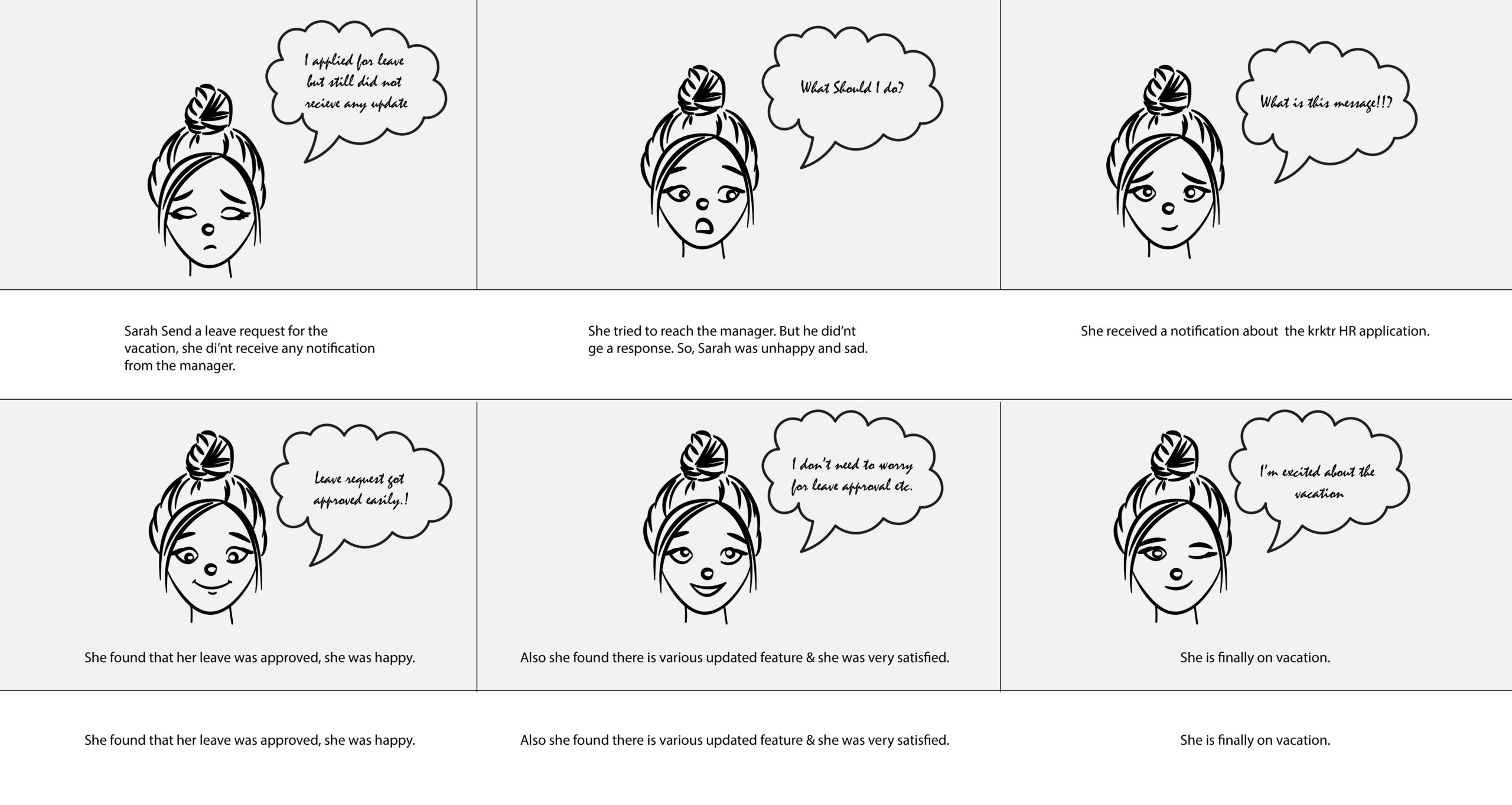
Storyboard
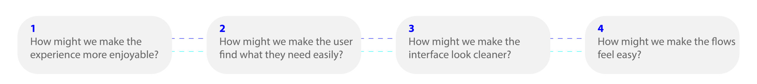
How Might We
How might we statements were used to translate problems into opportunities for design?
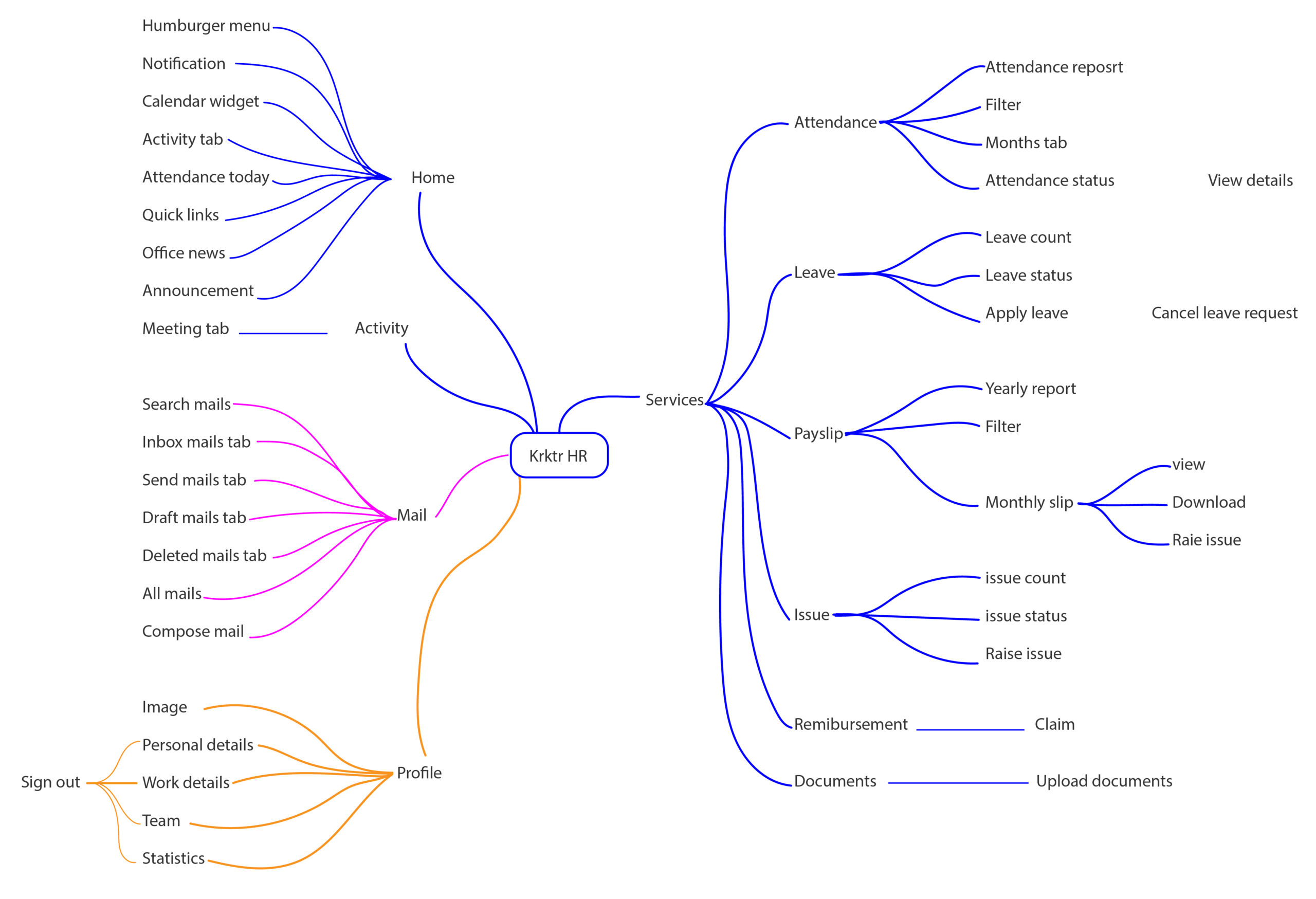
User Flow
Thanks to user flows, I better understood how Sarah needs to use the app.
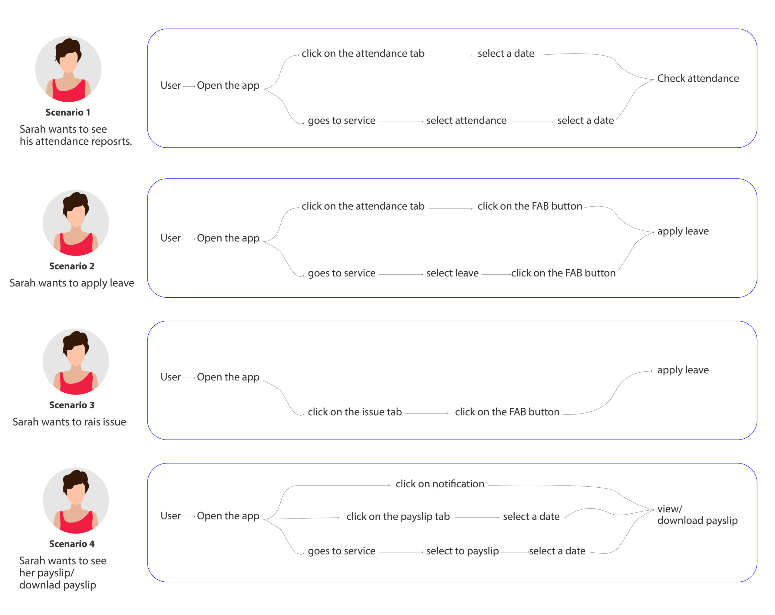
User Flow
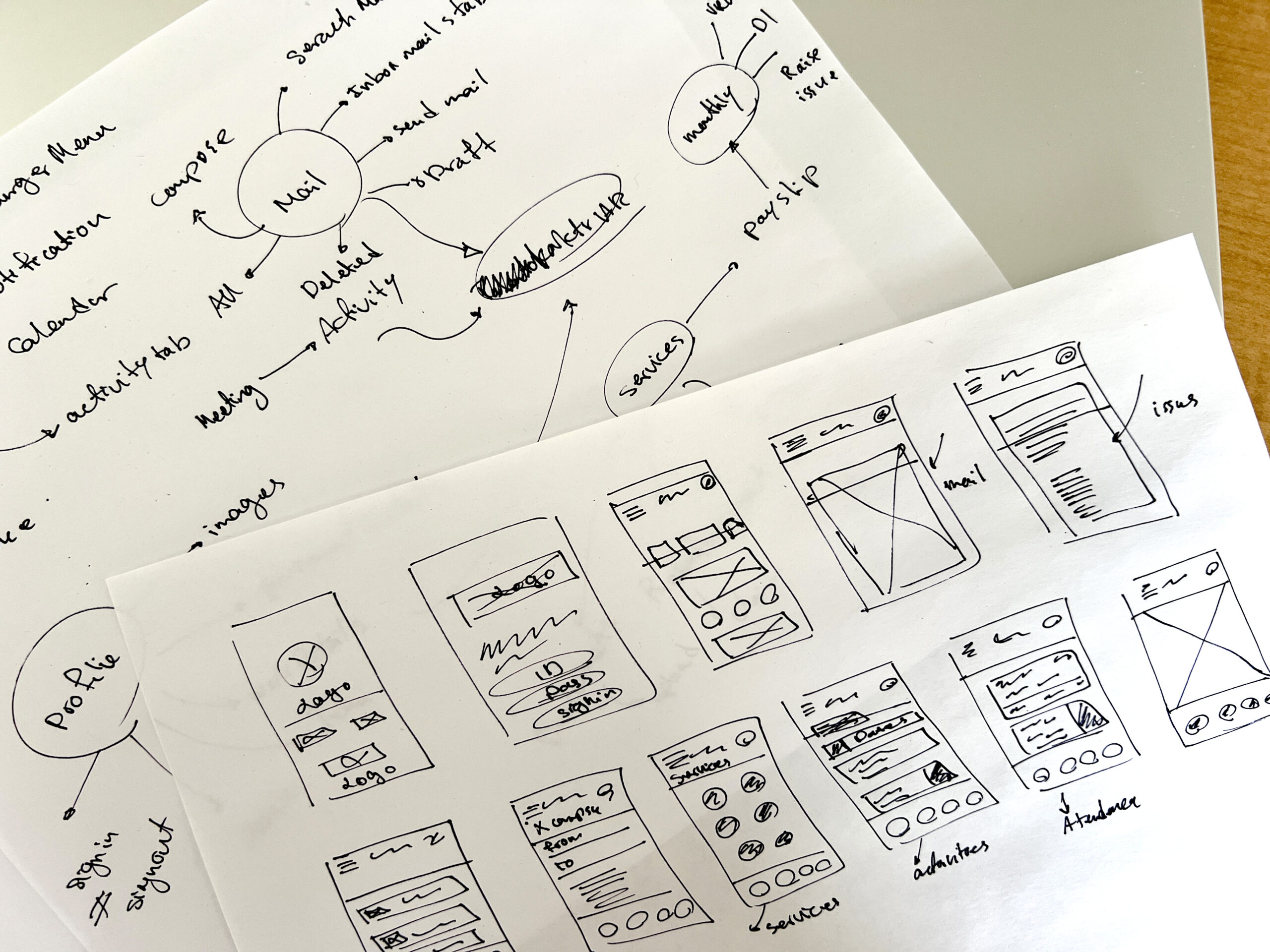
Sketch
I started rapid prototyping and imagining how Ilavarasan would use the app.
Key Takeaways
- The bottom nav bar is needed to organize and divide all the options and features.
- Services should be on the Home screen to help users stay motivated.
- There should be a consistent services section.
Low-fidelity Prototype
After a few iterations, I wanted to try these wireframes. I used Figma to link the wireframes to the prototypes.
Design System
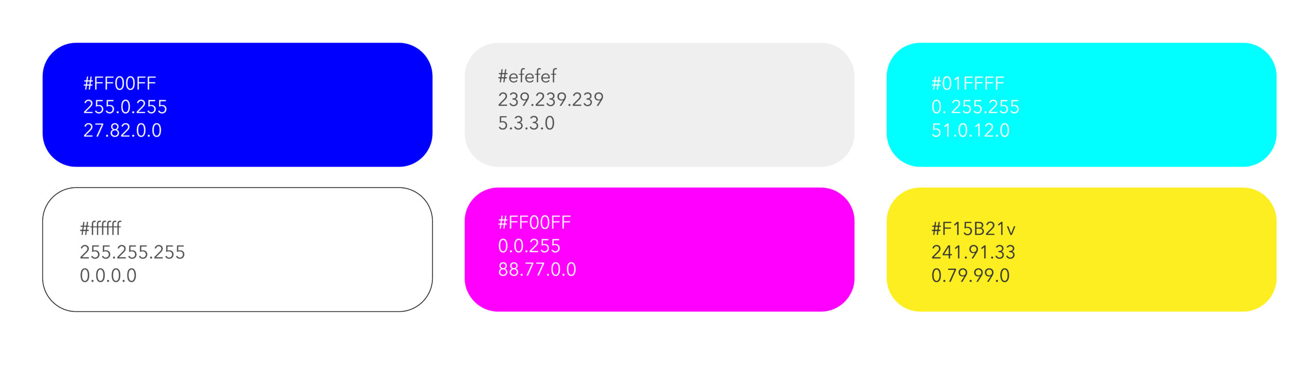
Colors
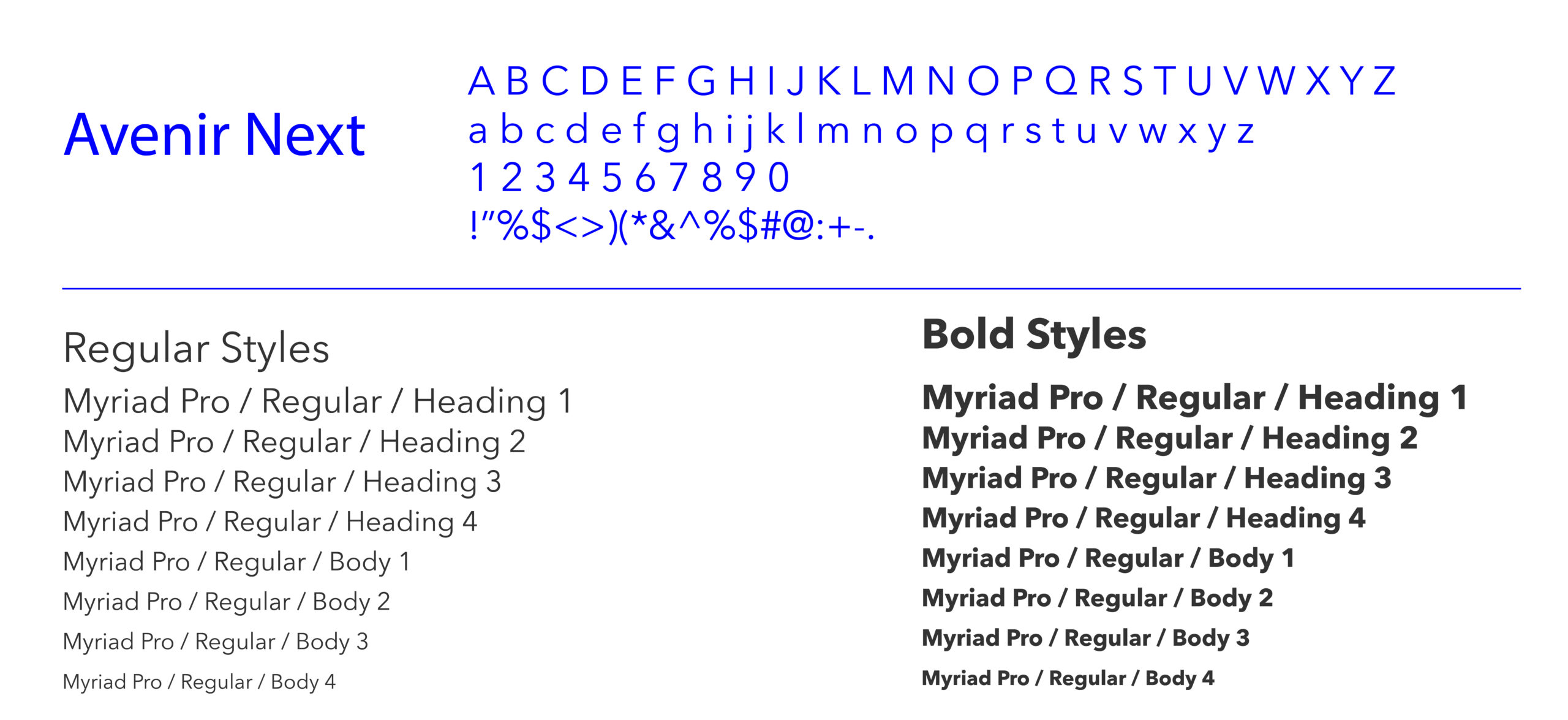
Typography
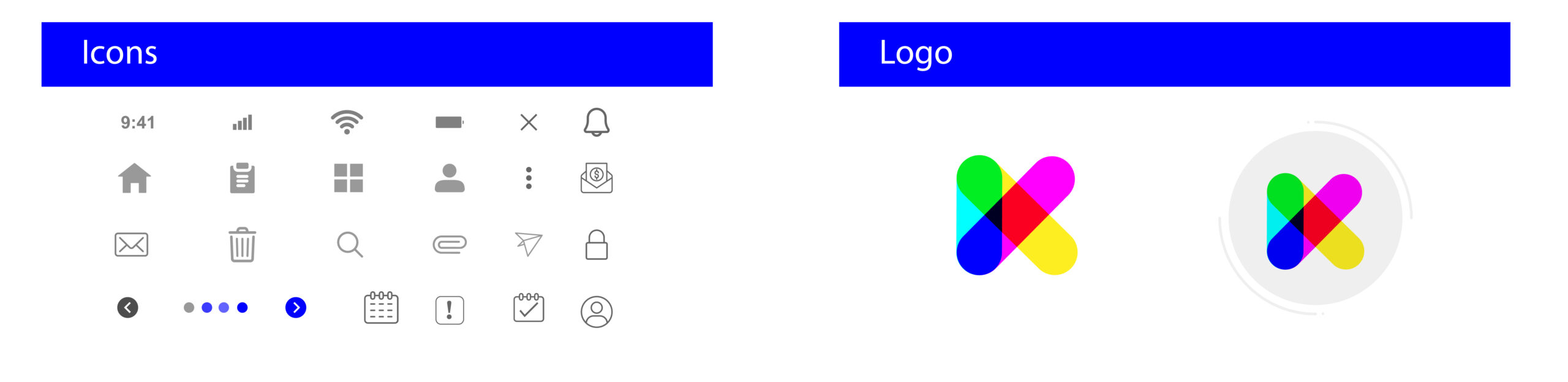
Icon Graphy
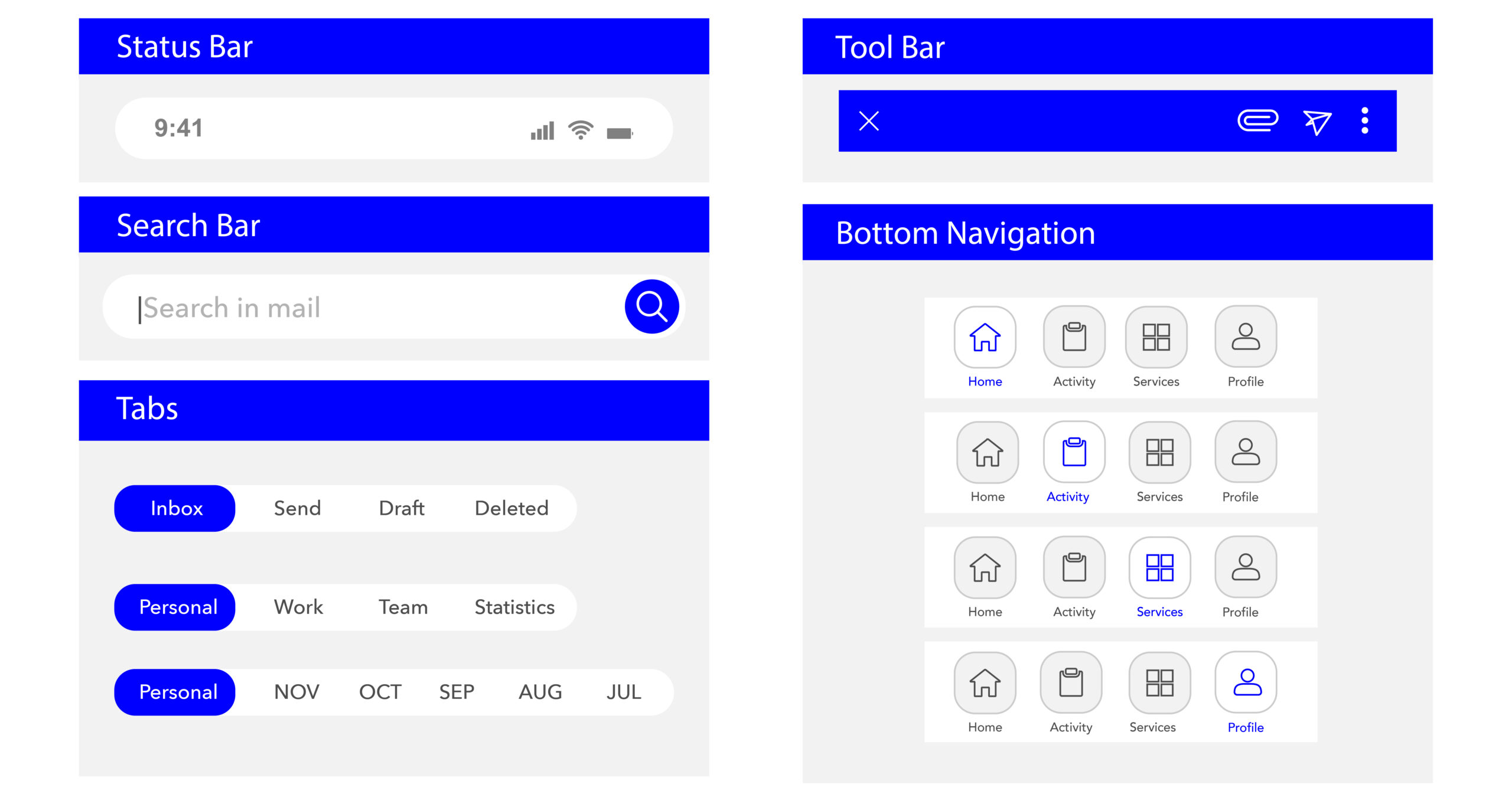
Bar
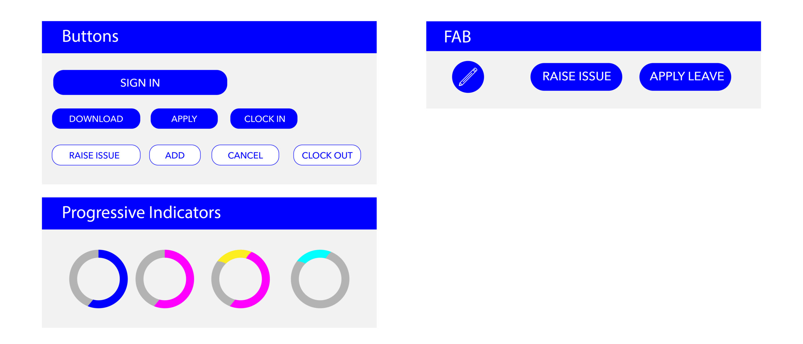
Controls
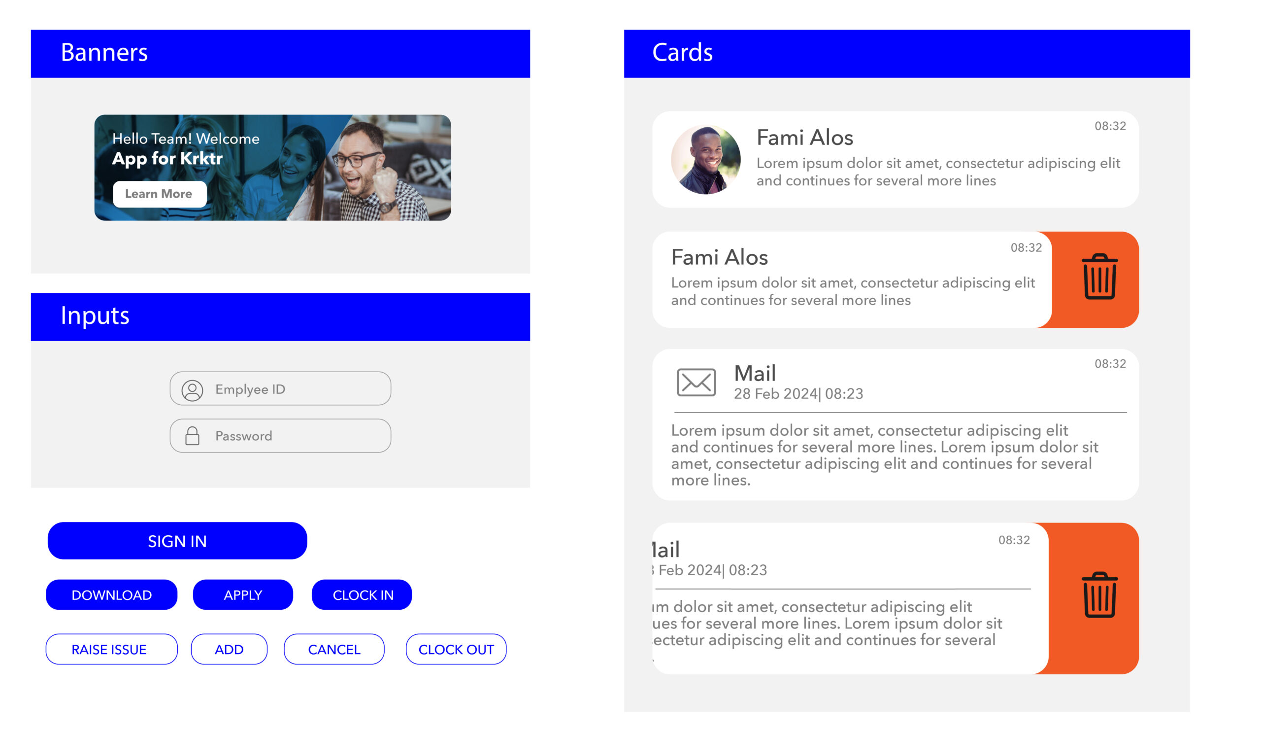
Containers
Visual Screen
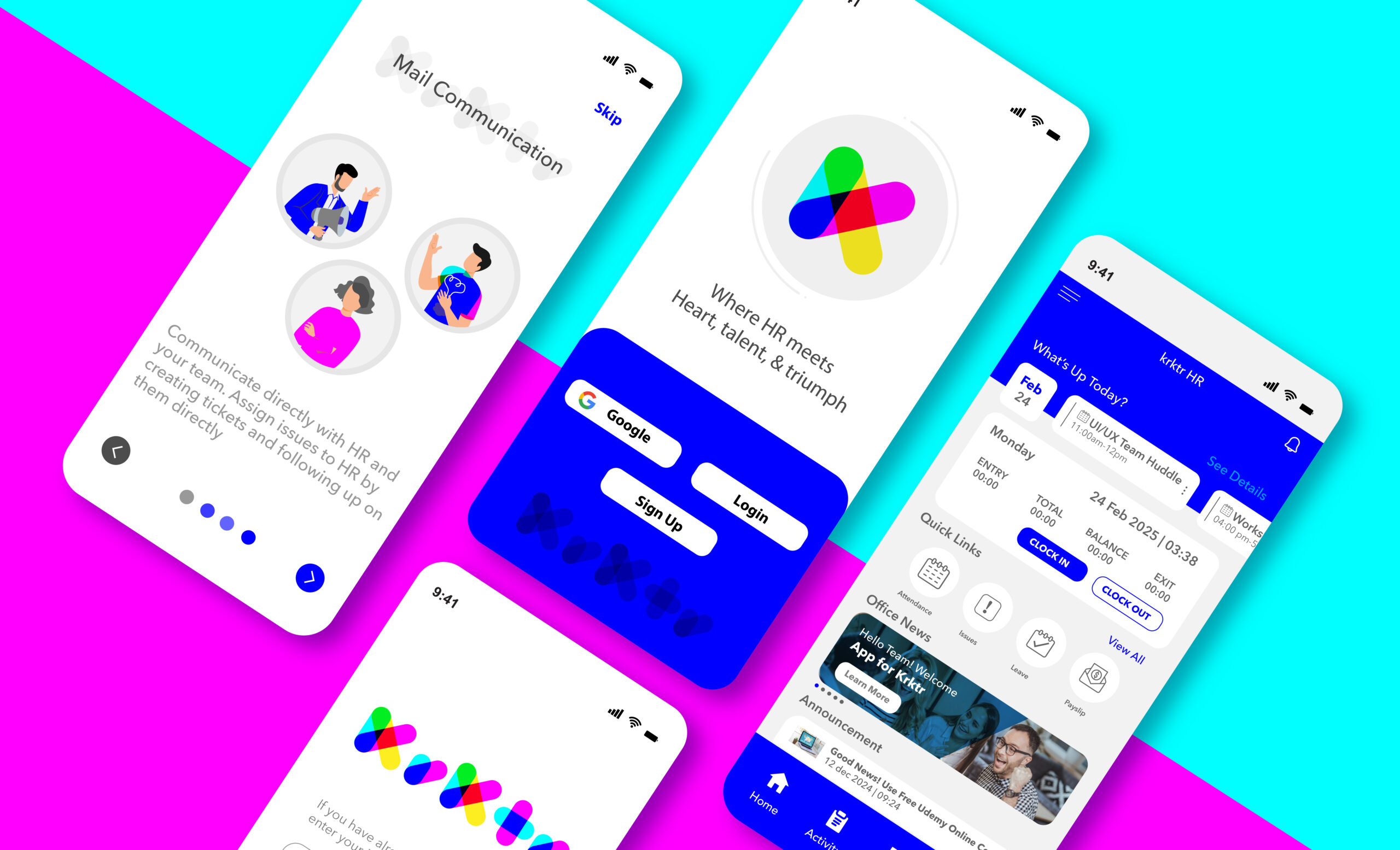
Welcome & Login
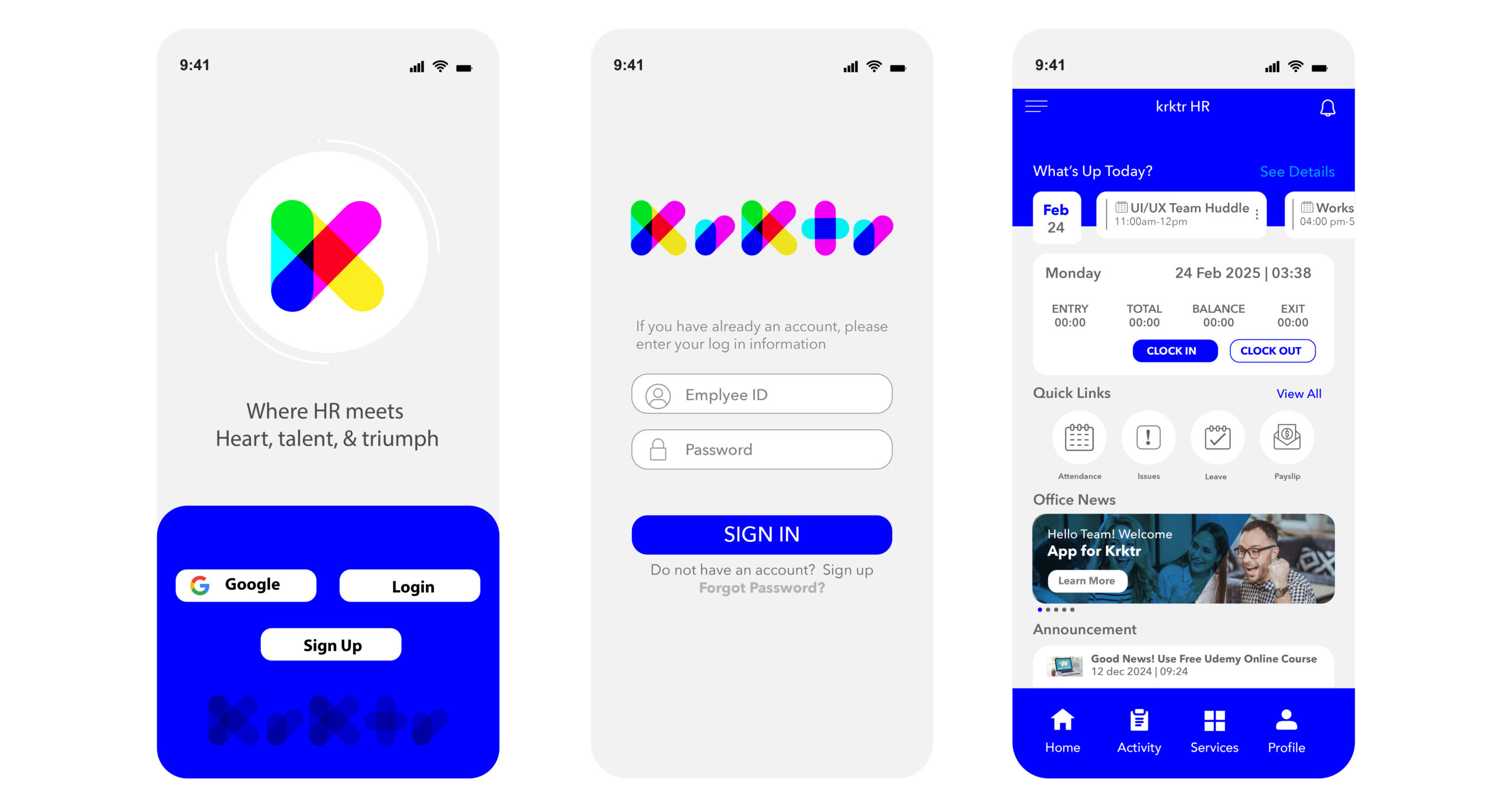
Notification
- Easy access from one place
- Expand for quick action
- Click to get to the related HRMS module
- Clear all to remove all
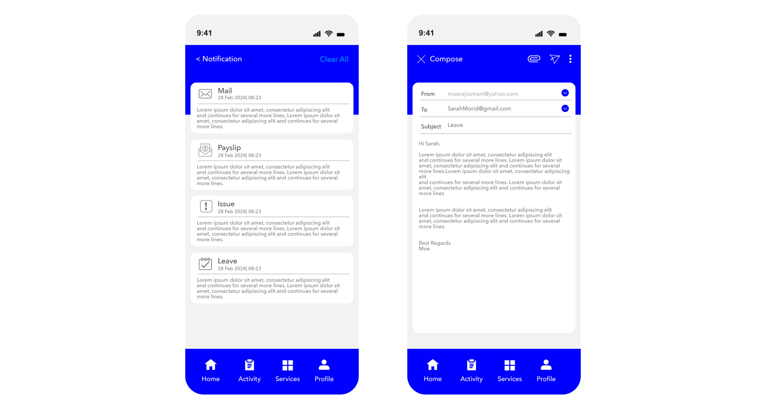
Attendance
- View a precise breakdown of attendance timing for all days of the year
- Raise an issue for any day whose attendance has been incorrectly recorded
- Filter and sort records as per the desired permutation
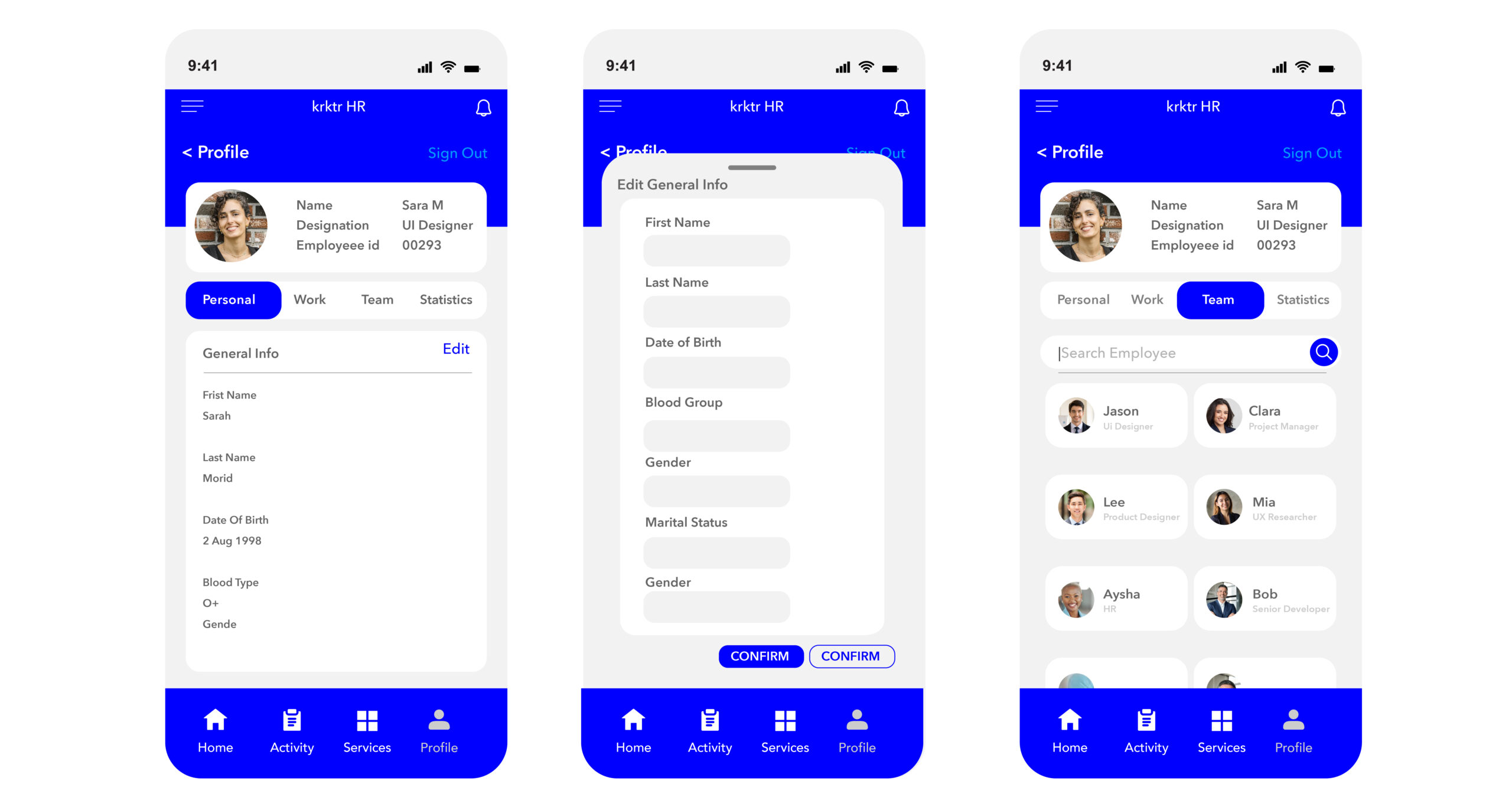
Profile
- All are elegantly organized across 4 tabs
- Personal
- Work
- Team
- Statistics
- Employees themselves can edit their info
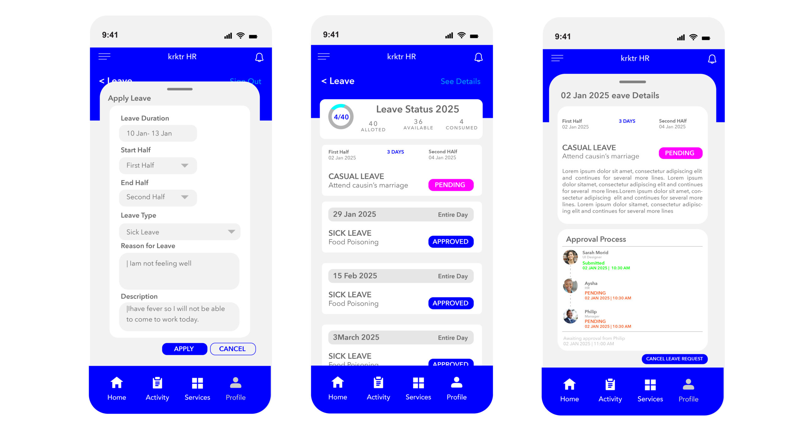
Leave
- Apply and track the status with ease
- Cancel leave request