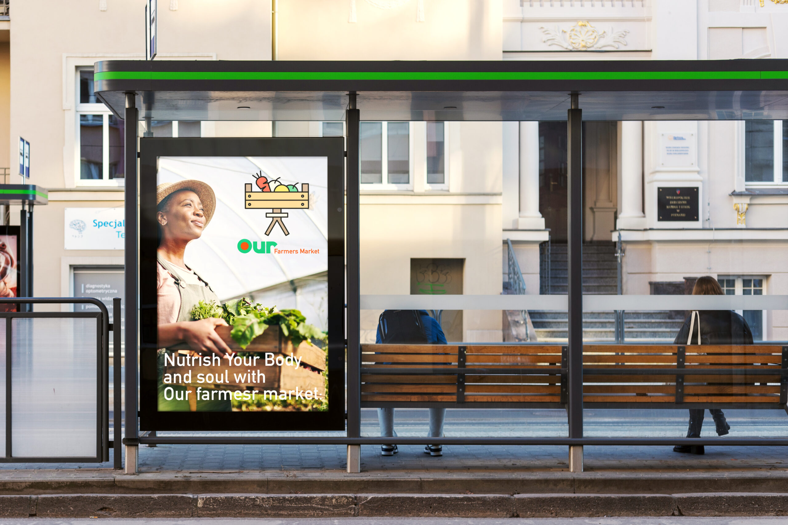
Our Farmers Market
Overview:
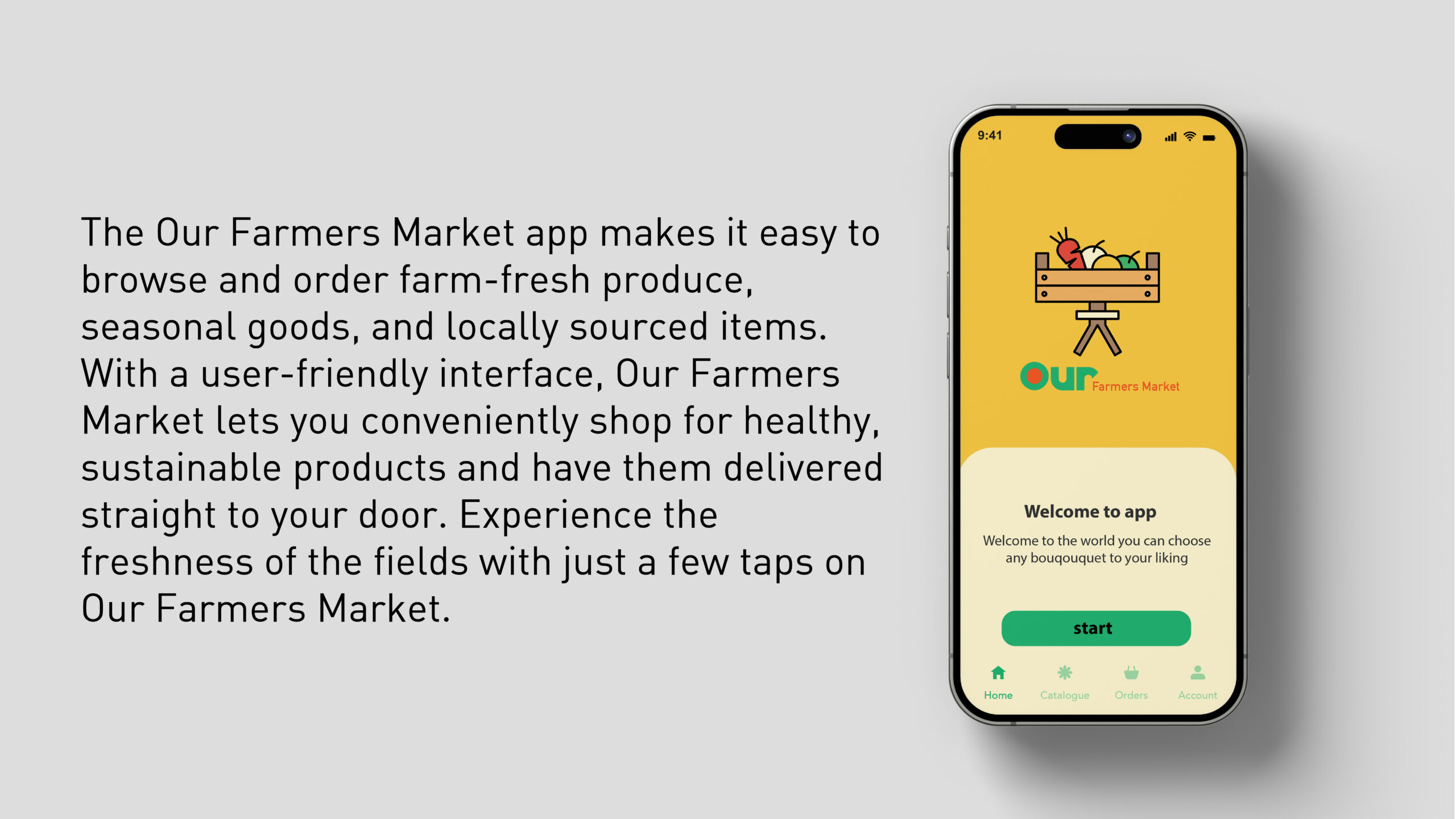
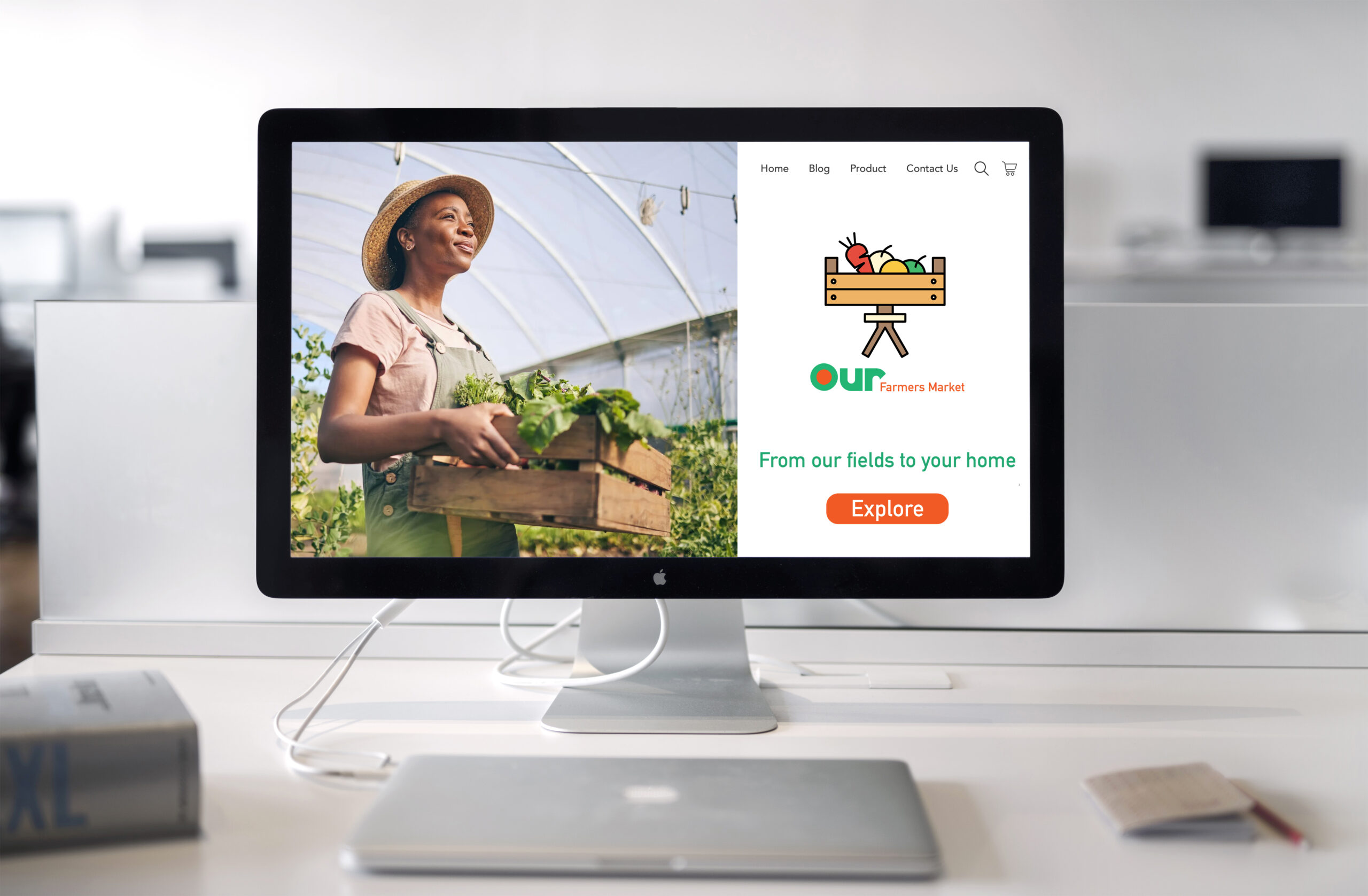
Our Farmers Market is an online marketplace and brand dedicated to bringing fresh, locally sourced produce directly from farms to consumers’ homes. Rooted in sustainability and community, the brand emphasizes accessibility, transparency, and a deep connection between farmers and consumers.
Objective:
To develop a strong and inviting brand identity for Our Farmers Market that reflects its commitment to freshness, nature, and quality. The visual identity will feature a customized sans-serif typeface with a unique letterform, emphasizing the “O” to symbolize growth and unity. The color palette will draw inspiration from natural elements, evoking warmth, trust, and the vibrancy of farm-fresh produce. The design leverages elements like baskets, fruits, and vibrant colors to evoke a sense of abundance and warmth.
Design Approach:
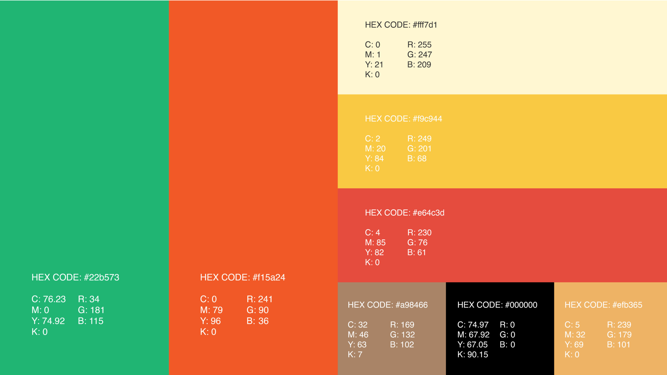
Colors:
The color palette features deep green for nature’s richness, bright orange for energy, and soft yellow for warmth and joy. These vibrant, earthy tones reinforce Our Farmers Market’s mission of delivering fresh, sustainable, locally sourced produce.
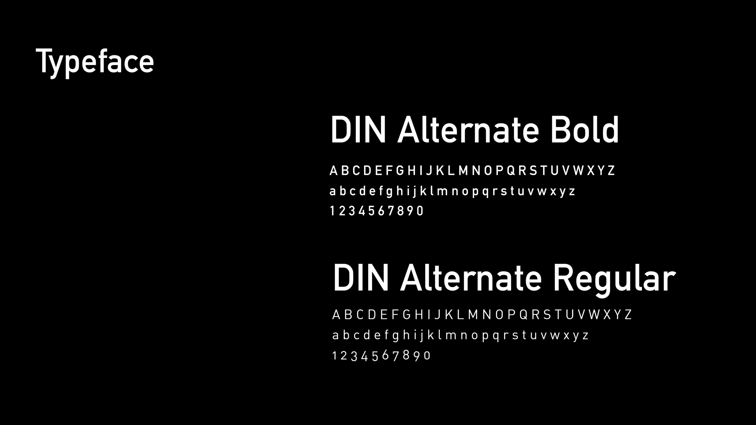
Typography:
DIN Alternate Bold” brings a clean, modern look, reflecting the brand’s transparency and professionalism. The word “OUR” uses a Super Bold typeface to highlight community and inclusivity, creating a strong and memorable identity.
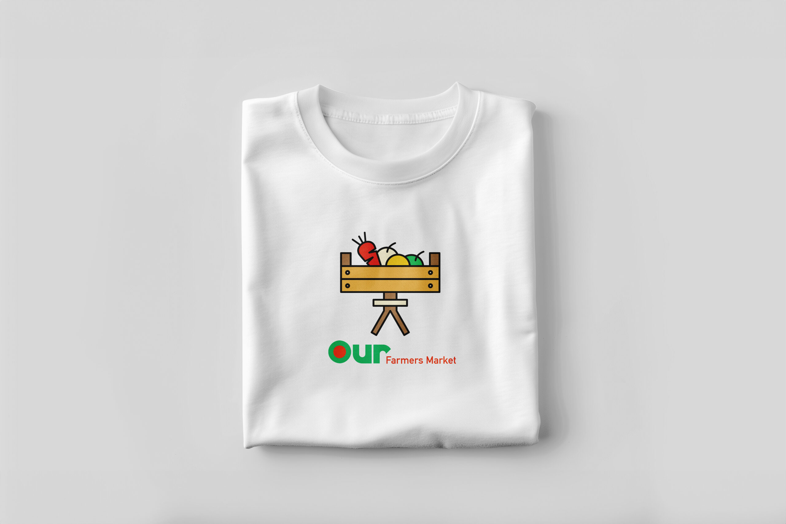
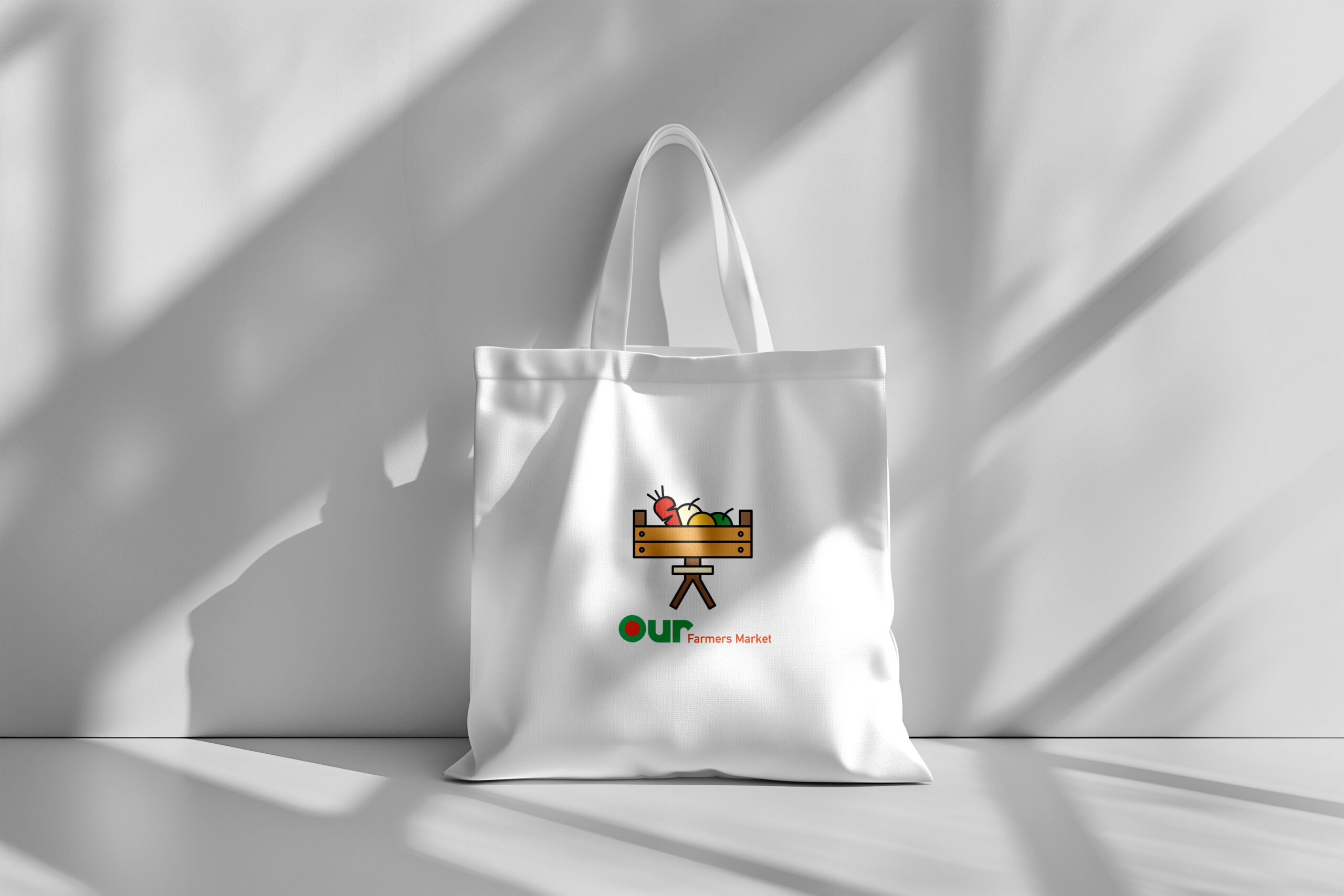
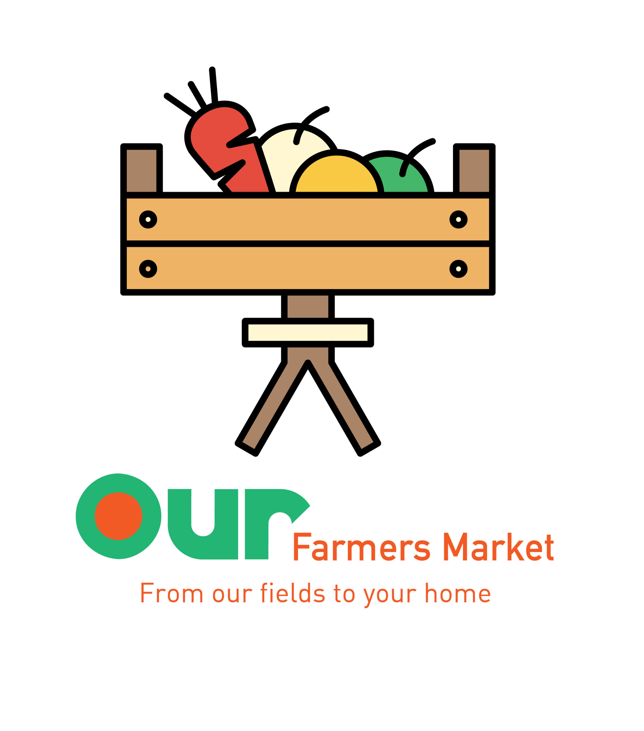
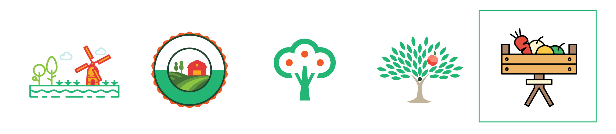
Logo Mark
Some of the options that the client liked, as well as the one that was ultimately finalized-
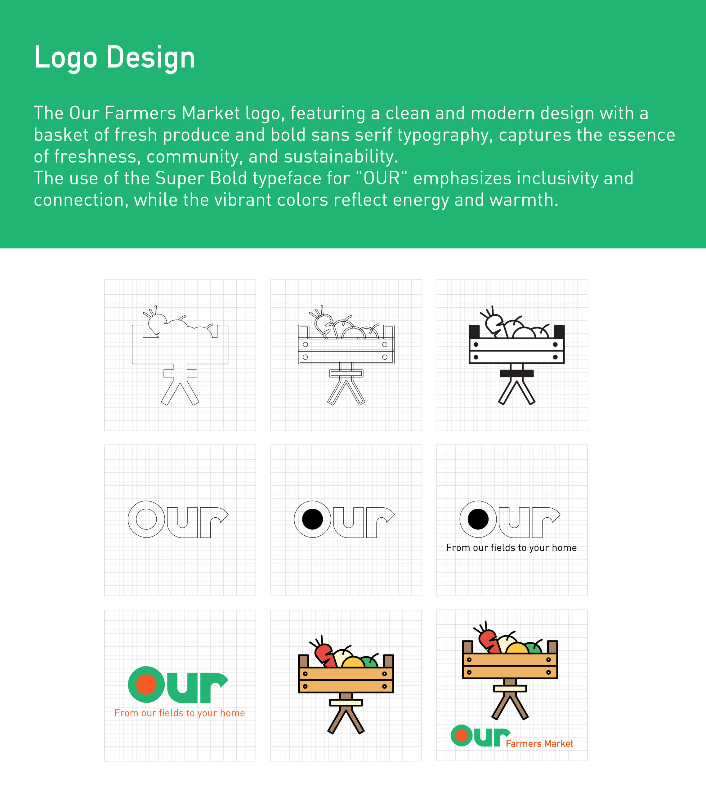
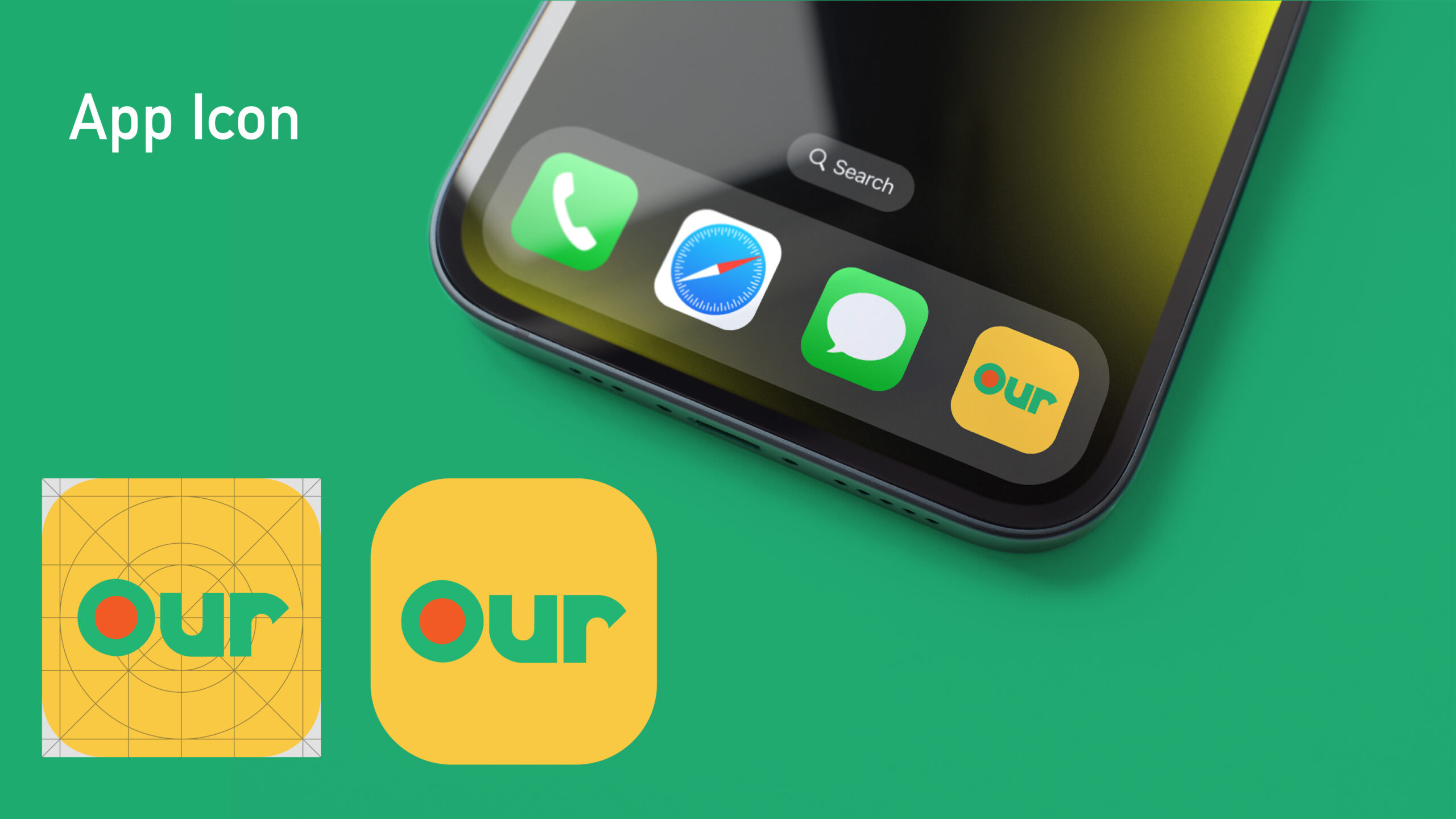
This adaptable logo works seamlessly across packaging, marketing materials, and digital platforms, making it a key element in building brand recognition. Its consistent use establishes Our Farmers Market as a trusted and approachable brand, resonating with customers and fostering loyalty.
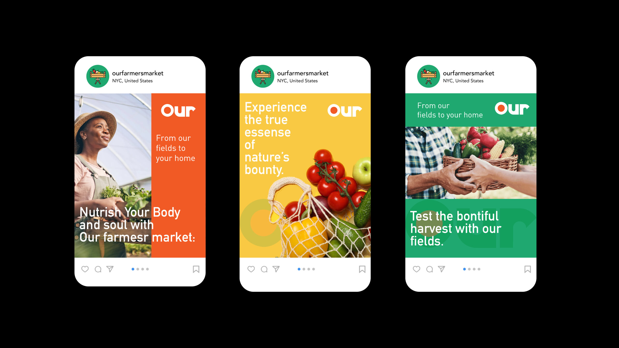
Landing Page
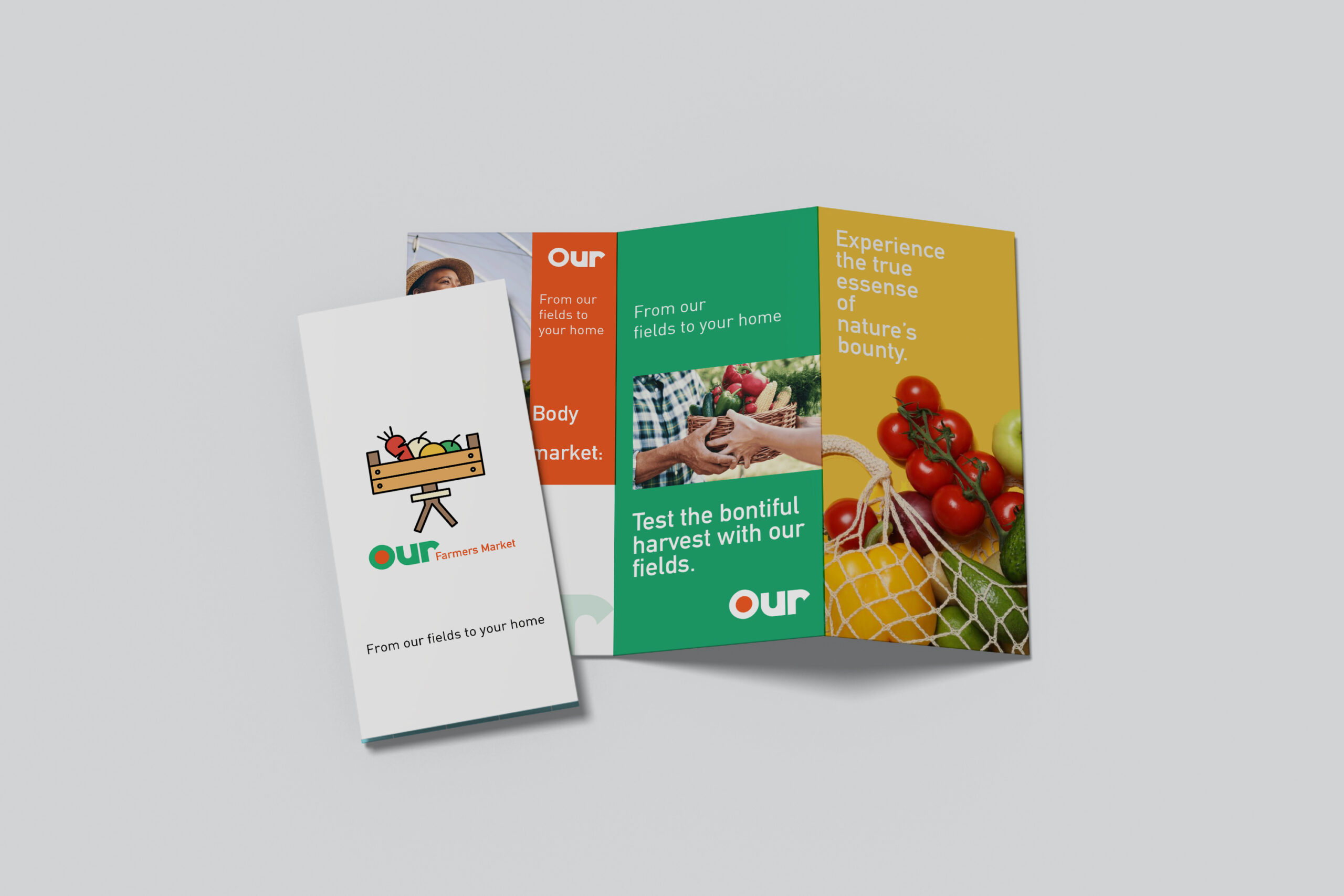
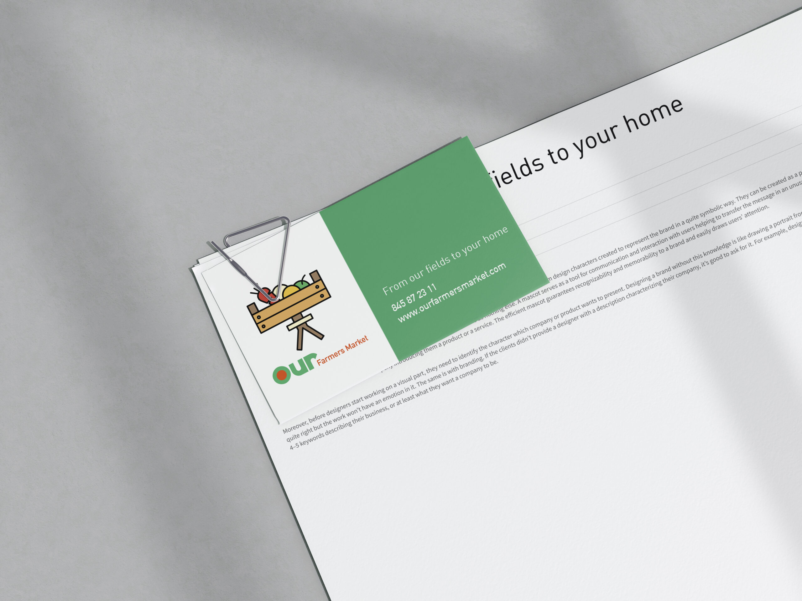
Print Design